Advocating for service design and the users
For every project, the most challenging was always advocating for a service design approach and for our users. Here are some examples of visuals and methods I've used with different stakeholders.
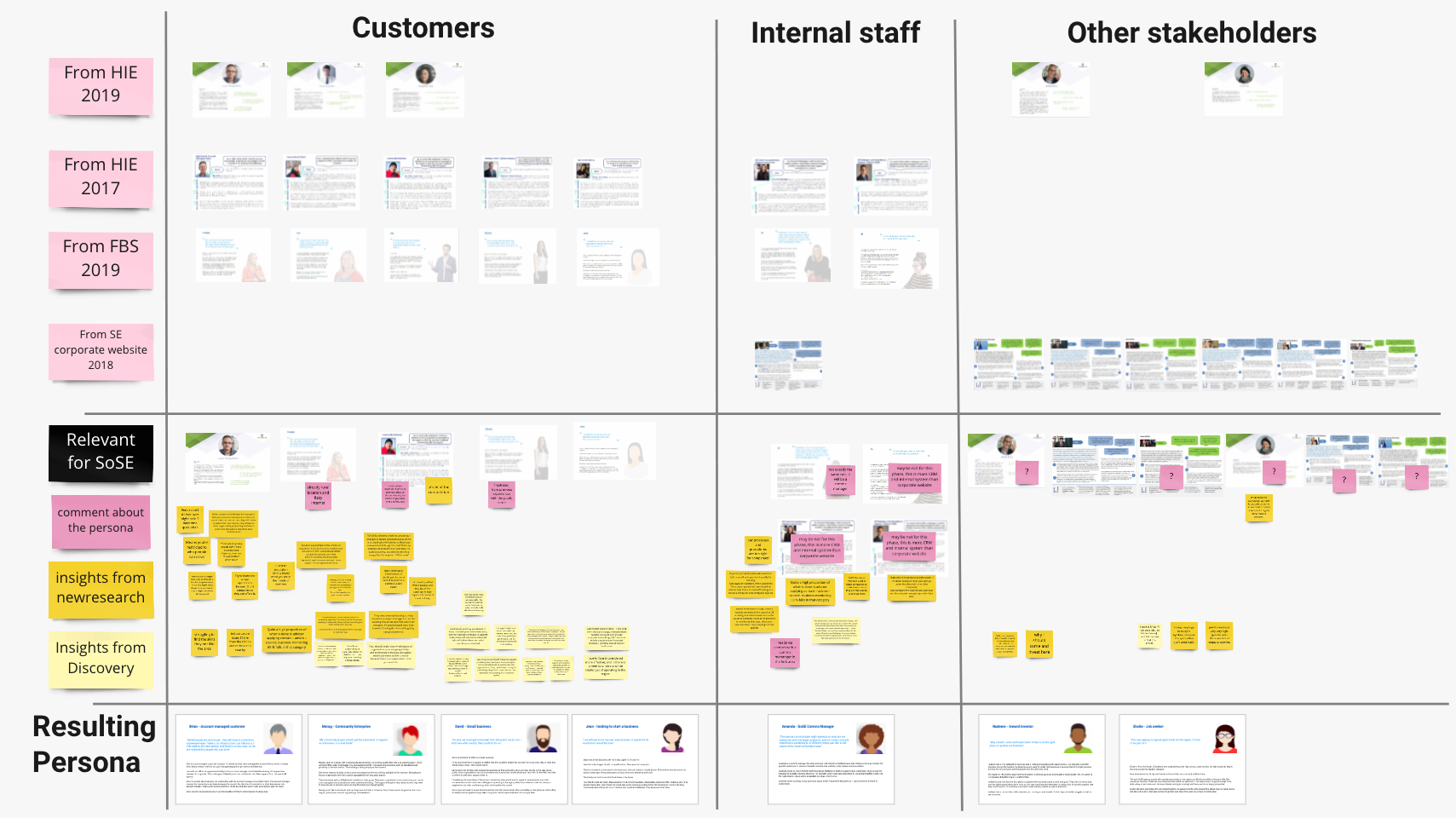
Creating persona
Context
This project was about creating a new website for South of Scotland Entreprise - a new agency.
We needed to get the content right for businesses and organisations from this area, with the right tone.
Creation process
- look at previous persona from previous research which could be relevant
- use research insights from two large public consultations done with local businesses before I started on the project
- add insights and real quotes from fresh research interviews done face to face with local organisations with a user researcher
Advocating for our users
The resulting persona helped advocating for our users when we were creating the content and structure of the website.
I could remind the team and the stakeholders of our users needs, context and priorities. The decision makers were not very receptive to the concept of user needs initially, so the persona was a good tool to use.
Assessing our service and setting priorities
Context
The previous team had been overwhelmed by the intense work generated by the COVID restrictions:
- a lot of new funding sources and guidances had to be published very quickly
- the Scottish Government had chosen the website to be the place to post everything for businesses
I was part of a new team who took over. Most were new to service design but keen to learn.
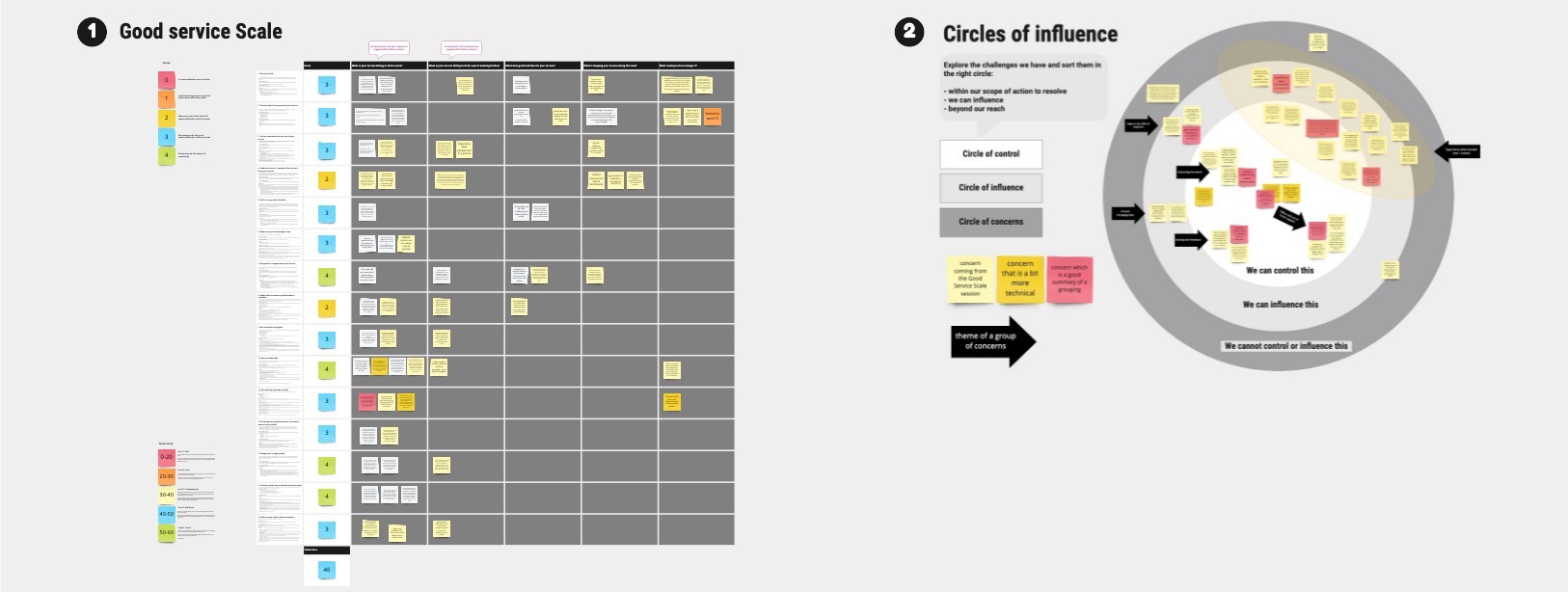
Using the Good Service Scale
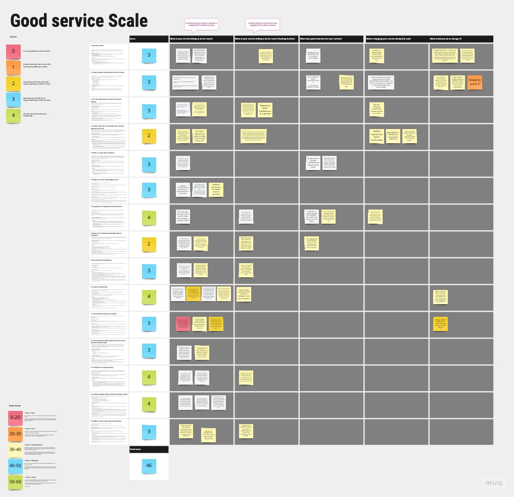
First we looked at the Good Service Scale of Lou Downe.
I facilitated a workshop where we used the scale to assess our service, as a team.
A lot of issues we had were not within our control, but some of them we could still influence.
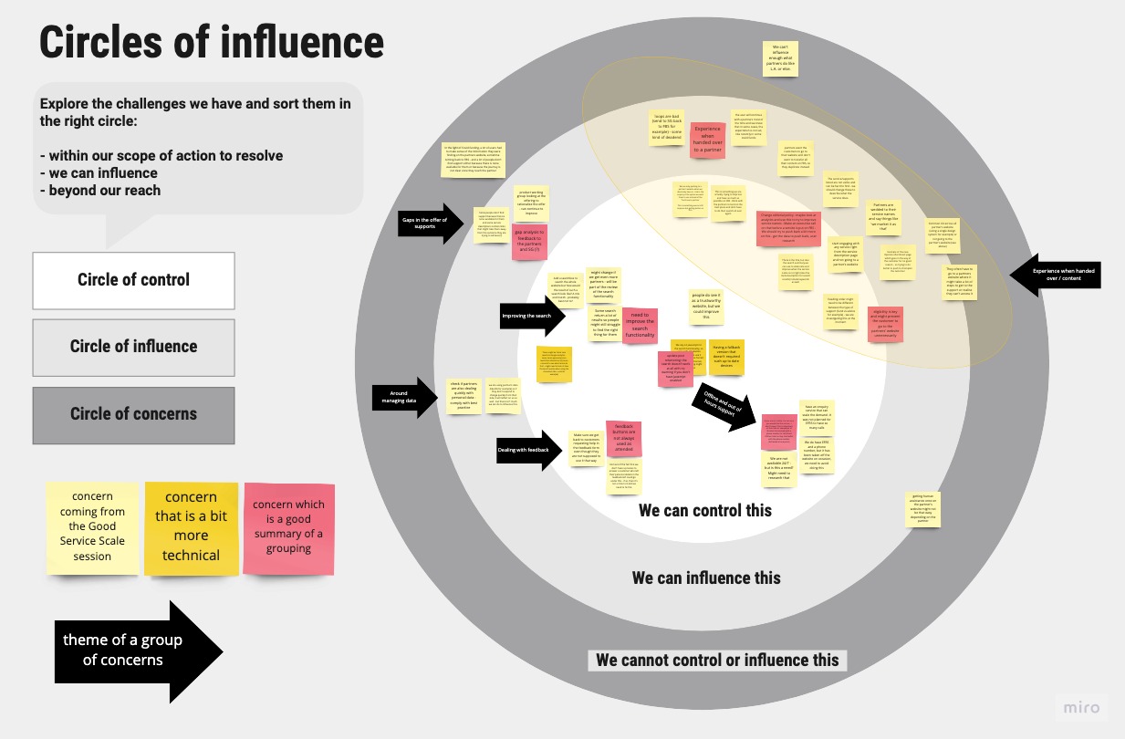
As a next step, we sorted these issues with the "Circles of influence” and grouped them by theme, not by principle this time. We reused the same sticky notes.
Now we could see the groups of issues we had control on and those we could influence. This helped to prioritise our work and take action.
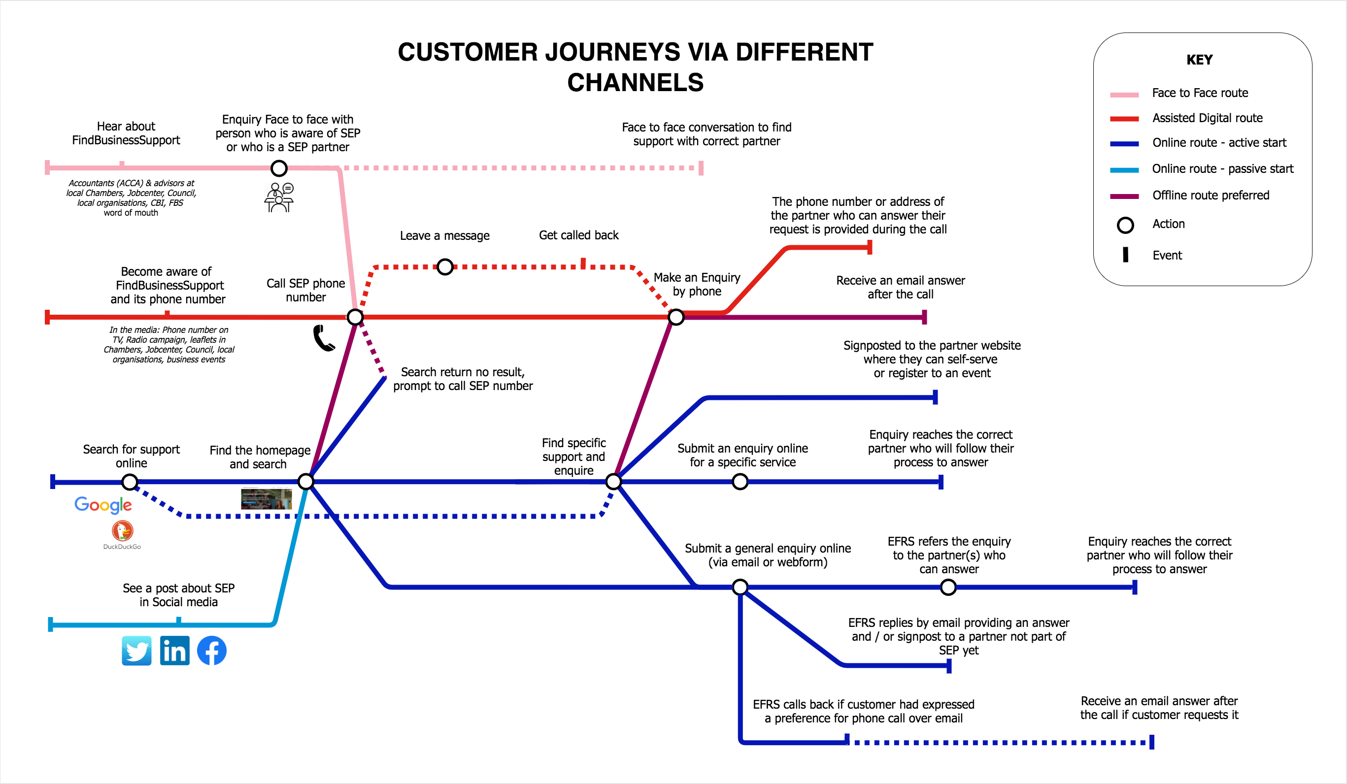
A tube map to illustrate the various channels of a service
Context
We were working on a new service to help Scottish businesses find all the supports available in the public sector.
The work was involving a partnership with other agencies and 4 workstreams working together.
We needed to get a shared understanding of the various channels the businesses could use to find the support they need.
Using a tube map format
Everyone loves a tube map
Everyone really liked the tube map as a visualisation tool. Especially the senior stakeholders.
It’s a great support for discussion.
It was the first time we used it (I wrote a blog post about it) and later we created a tube map for all our complex services.
